NotSo
Charleston’s hostel
Primary lockup
For the front door, website, and printed lead pieces.
NotSo Hostel / identity study
NotSo already has the hard part: a place with a point of view. This concept turns that hand-painted, open-door character into a working identity that can live on a key card, a post, a sign, and a screen.
NotSo
Charleston’s hostel
Since 2007 / Spring Street
Stay curious.
Stay awhile.
Charleston’s original
independent hostel

A host campaign concept made with Vikki’s existing portrait, typography, and a print-first layout. No photo treatment needed.
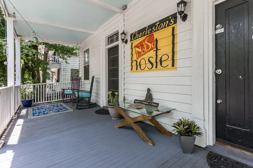
The source material
01 / Begin with the real thing
The existing sign is not a problem to be polished away. Its framed lettering, brass glow, and easy imperfection are the usable cues: a warm black ground, a drawn border, expressive display type, and one unmissable name.
The identity should feel like it belongs on this porch before it belongs in a browser.
02 / A small, flexible kit
NotSo
Charleston’s hostel
Primary lockup
For the front door, website, and printed lead pieces.
NotSo
Charleston’s hostel
Reversed lockup
For night signage and the dark surfaces that give the system weight.
Small-space seal
For a favicon, key tag, social avatar, or approval stamp.
NotSo
Sign line
A repeatable frame detail, lifted directly from the original sign.
Color, with jobs
#1B1712
#C0562F
#2C4536
#C79A46
#F5EFE2
Type, in use
Come as you are.
Fraunces carries the invitation. Inter handles the useful stuff: dates, directions, rates, and room names.
03 / Brand in the guest’s hand
NotSo
Welcome home
Room 12
is yours.
Key card / front
Wayfinding system
03
Bath
12
Room
P
Porch
K
Kitchen
Familiar room information becomes calm, durable, and unmistakably part of the place. The frame is a system, not decoration.
A real social template
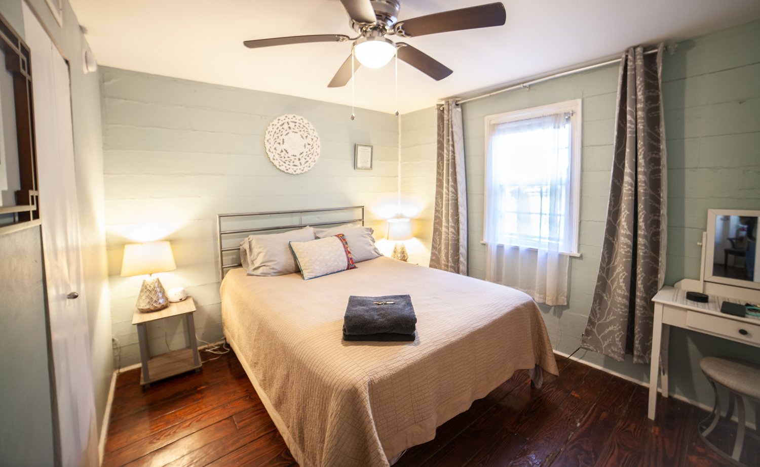
Charleston, SC
Porch people.
NotSo
Full-color photography gets to stay full-color. The consistent part is the crop, the clear hierarchy, and the small set of repeatable brand moves.
What this demonstrates
This is a concept, not a claim that the existing hostel should be erased and replaced. It is a demonstration of how a one-on-one build can find the good material already in a business, then give it the structure to show up consistently everywhere.